
5D Configuration – Workflow Stages
The following guide will show you how to navigate and use the 5D Configuration Section.
To access the “Workflow Stages” page click on the “Configuration” tab on the left of the screen and then click on “Workflow Stages”
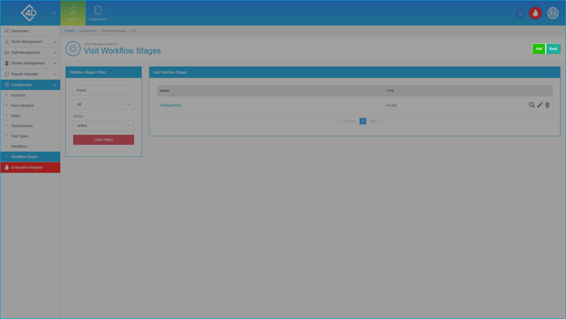
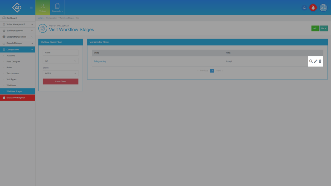
The “Workflow Stages” page will then open and will look like the image below.
The “Visit Workflow Stages” table shows a list of the workflow stages that are currently active on your system.
Listed are the name of each stage and the type.
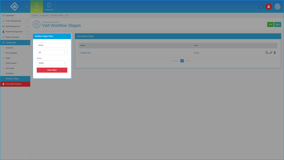
You can search for a stage by using the “Workflow Stages Filters” section on the left side of the screen.
You can filter by the “Name” of the stage, the “Type” and by the “Status”.
To reset the filter click the “Clear Filters” button.
Changing a Workflow Stage
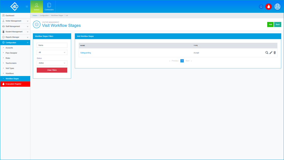
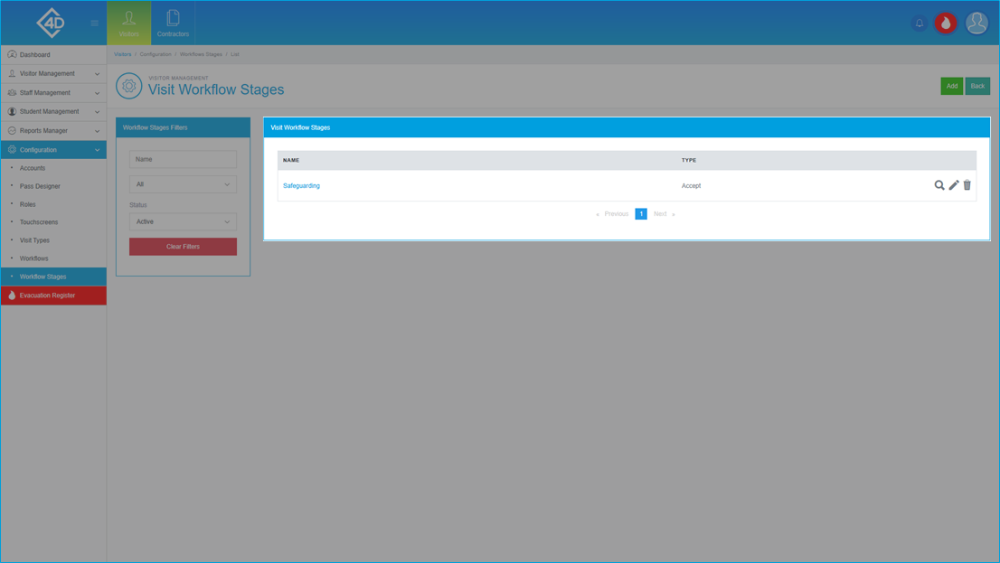
To edit the stage click the grey pencil on the right side of the screen.
If you would like to preview the stage, click the grey looking glass.
You can also delete the stage by clicking on the grey bin, you will be prompted to confirm your choice if this is clicked.
Please note that deleted stages cannot be reinstated so any change will be permanent.
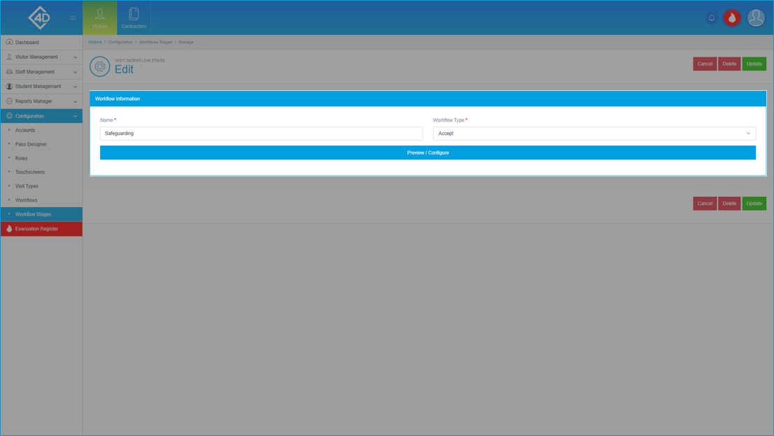
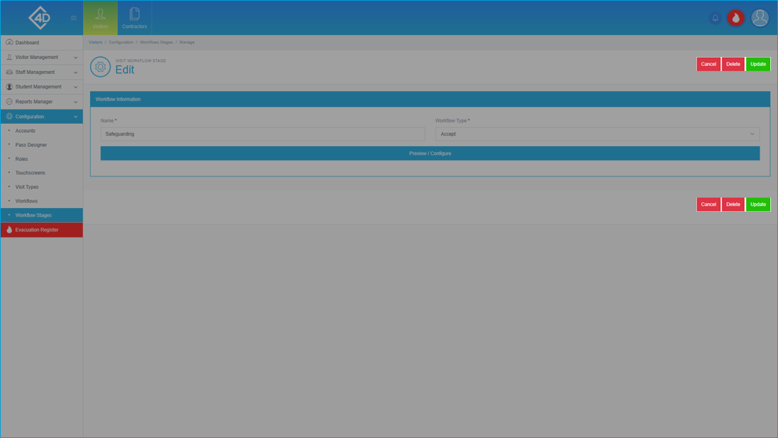
Once you have clicked on the grey pencil you will be taken to the following screen.
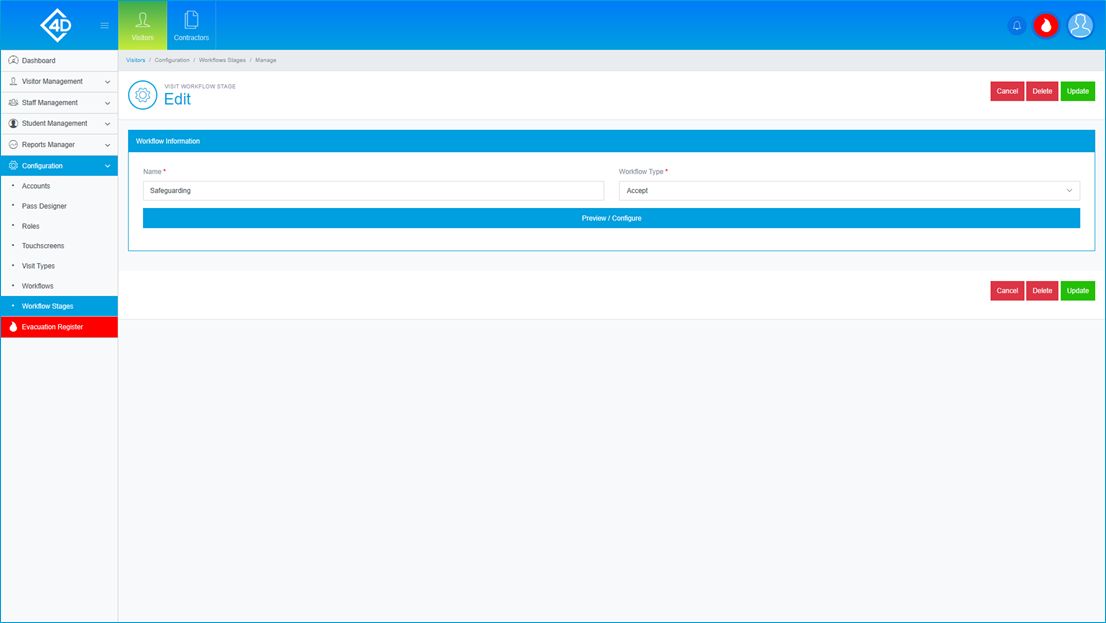
In the “Workflow Information” section there are the following options:
- Name – You can set the name of your workflow stage here.
- Workflow Type – You can choose between the listed types of stage, this includes “Accept”, “Proceed” and “Question”.
- Preview / Configure – This button will take you to the stage designer.
Once you have clicked on the “Preview / Configure” button you will be taken to the following page.
By default, the workflow will have a title at the top of the screen, if you would like to remove this simply delete the text.
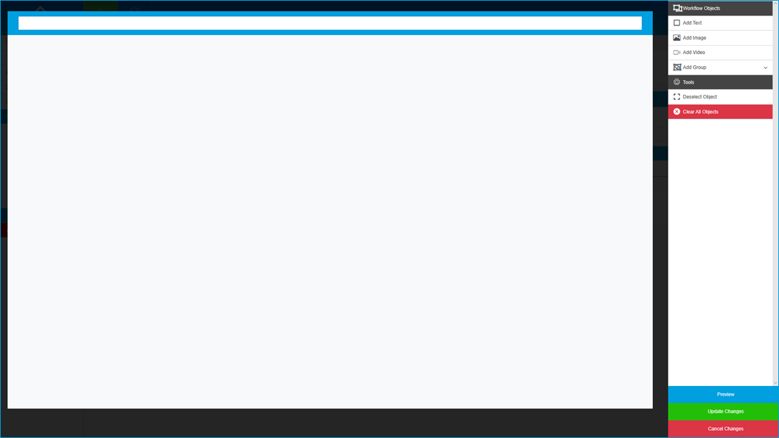
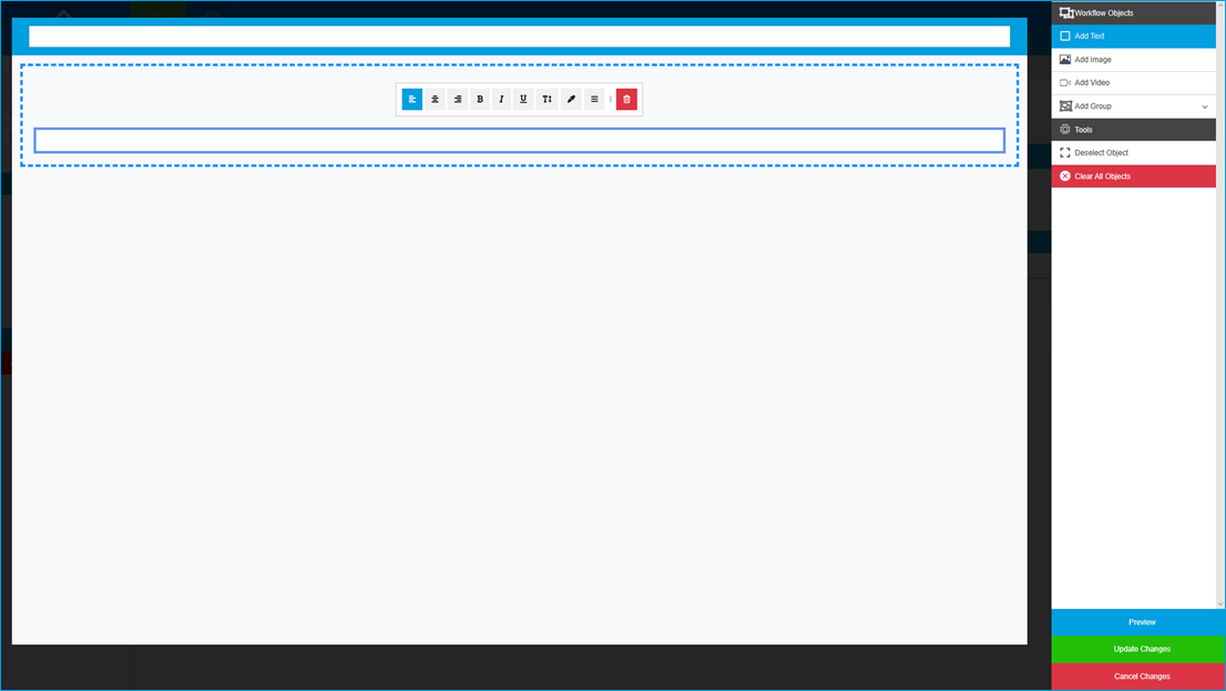
The “Add Text” button creates a box which you can fill in to include any information which the visitor may need to read.
- Box 1-3 – You can change the alignment of the page by using the three alignment buttons.
- Box 4-6 – You can choose to enable “Bold”, “Italics” and “Underline”.
- Box 7 – You can choose to change the size of the text.
- Box 8 – You can pick a colour to match your branding.
- Box 9 – You can choose between single-line and multi-line text.
- Box 10 – This is used to delete the box if you no longer wish for it to be in the stage.
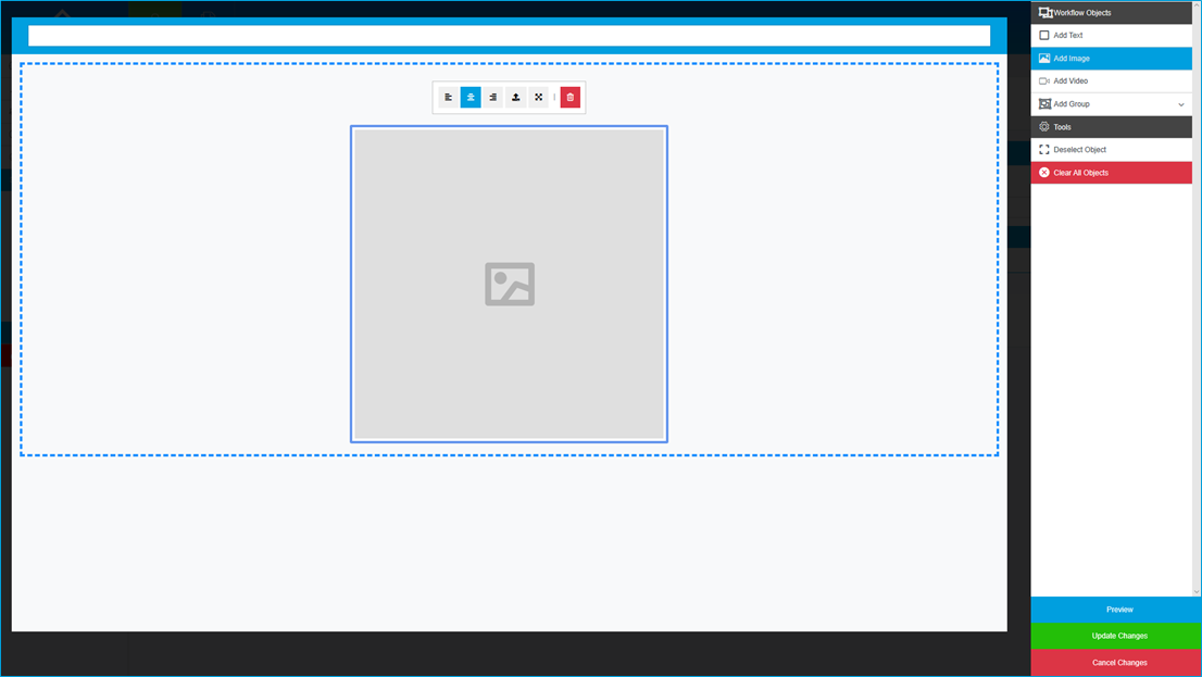
The “Add Image” button creates an image box which you can use to upload your own image.
- Box 1-3 – You can change the alignment of the page by using the three alignment buttons.
- Box 4 – Click this button to open the image browser, then select the image file which you want to upload.
- Box 5 – You can choose to resize the image to fit the stage correctly.
- Box 6 – This is used to delete the box if you no longer wish for it to be in the stage.
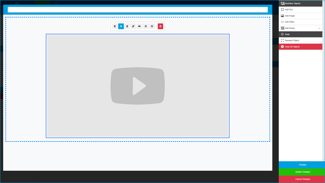
The “Add Video” button creates a video box which you can use to upload your own video.
- Box 1-3 – You can change the alignment of the page by using the three alignment buttons.
- Box 4 – If you wish to link an online video, click this button then paste the “Video URL”.
- Box 5 – This button is used to activate/deactivate the “Allow User to Skip Video” function.
- Box 6 – This button is used to activate/deactivate the “Automatically Play Video” function.
- Box 7 – This button is used to set the resolution of the video.
- Box 8 – This is used to delete the box if you no longer wish for it to be in the stage.
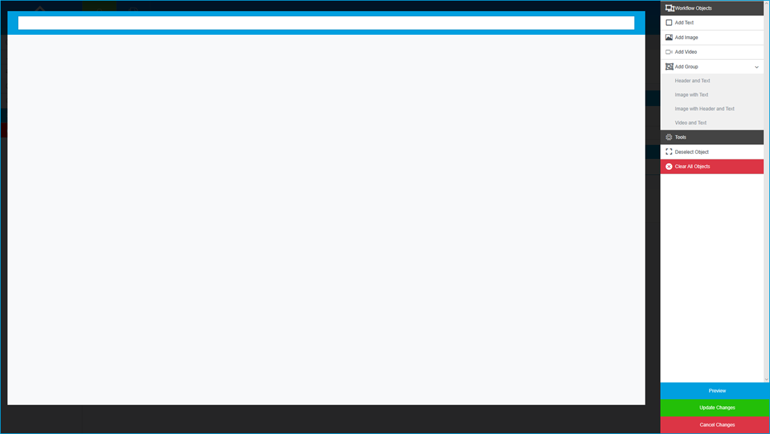
The “Add Group” button allows you to pick between 4 groups to show on the stage.
Each group is a combination of the previous boxes with the same features and are configured as such, they are as follows;
- Header and Text.
- Image and Text.
- Image with Header and Text.
- Video and Text.
There are a few remaining functions, they are as follows;
- Deselect Object – Click this button to deselect the current box.
- Clear All Objects – Use this button to wipe the stage back to a blank state.
- Preview – Use this when testing the stage, this is useful if you need to resize boxes.
- Update Changes – Use this button when you are happy with your changes.
- Cancel Changes – Use this button if you wish to cancel any changes that you have made.

Once you are happy with the changes that you have made, click the green “Update” button.
If you would like to cancel any changes that you have made, click the red “Cancel” button.
If you would like to delete the stage click on the red “Delete” button, you will be prompted to confirm your choice if this is clicked.
Please note that deleted stages cannot be reinstated so any change will be permanent.
Adding a new Workflow Stage
To add a new stage click the green “Add” button in the top-right of the screen.
To create your stage follow the steps in the “Change a Workflow Stage” section.