
5D Configuration – Pass Designer
The following guide will show you how to navigate and use the 5D Configuration section.
To access the “Pass Designer” page click on the “Configuration” tab on the left of the screen and then click on “Pass Designer”
The “Pass Designer” page will then open and will look like the image below.
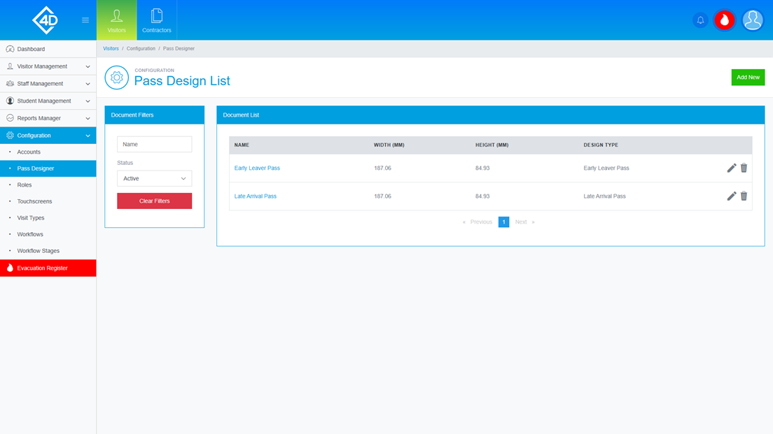
The “Document List” table shows a list of the pass designs that are currently active on your system.
Listed are the “Name” and size of each design, the pass design is then categorised by its “Design Type”.
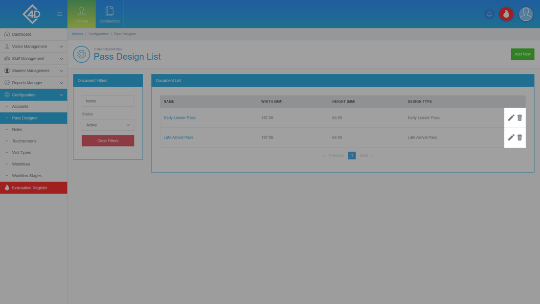
To edit the design you can click on the grey pencil on the right of the page.
You can also delete the design by clicking on the grey bin, you will be prompted to confirm your choice if this is clicked.
Please note that deleted designs cannot be reinstated so any change will be permanent.
On the left of the page, you can search for designs by their “Name” and “Status”.
The “Clear Filters” button will wipe both fields and display the default view.
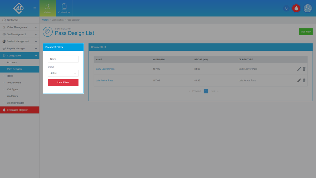
To add a new design click the green “Add New” button in the top-right of the screen.
Creating a new Design
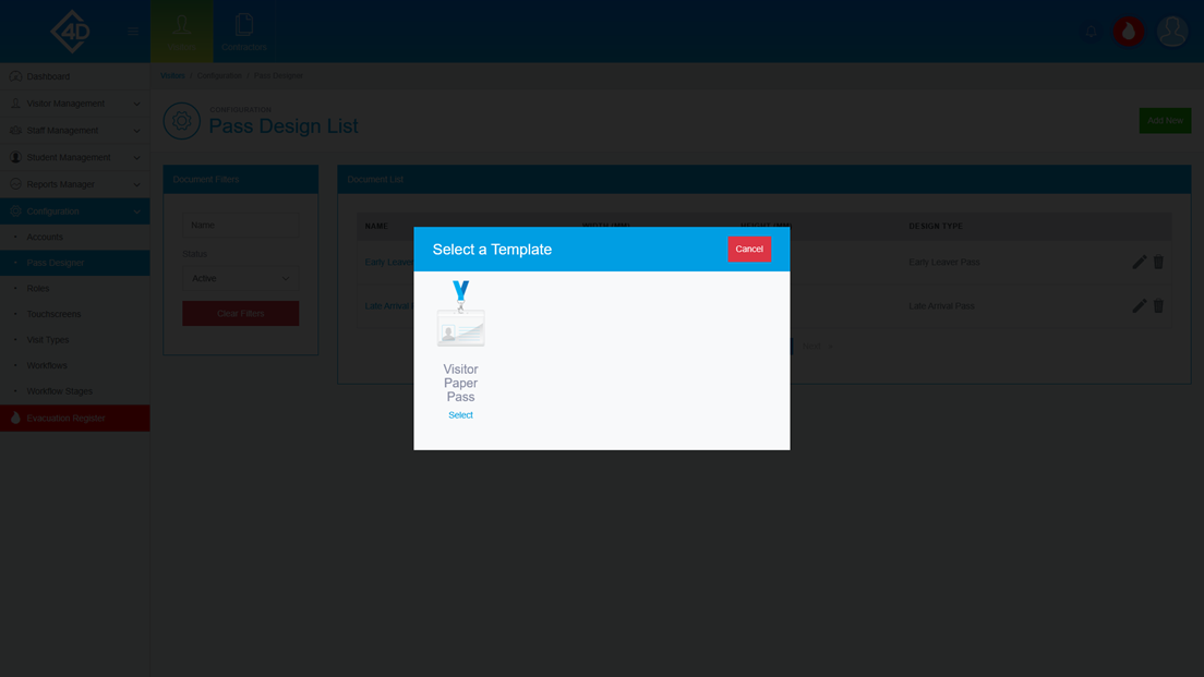
Once you have clicked on the “Add New” button you will be taken to the following screen.
You can choose the type of design to create, you can pick by clicking the “Select” button.
You can also cancel this action by clicking on the “Cancel” button.
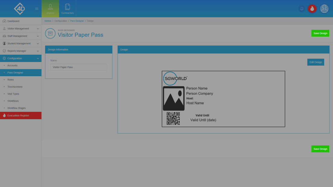
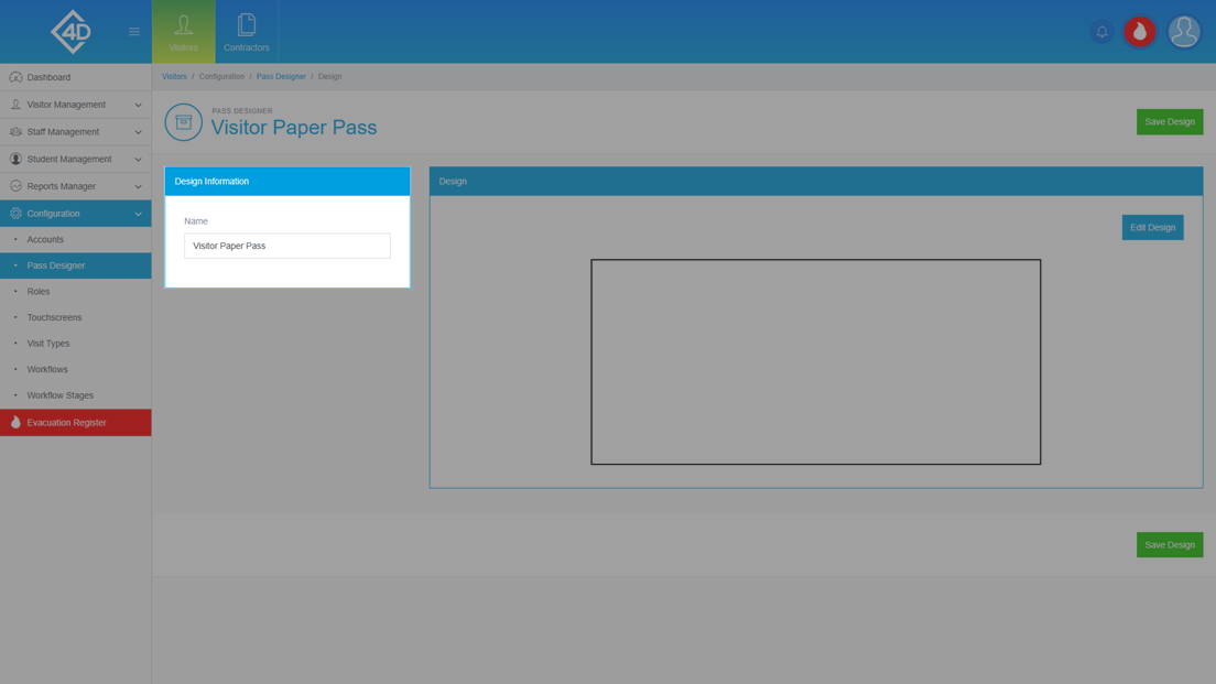
Once you have chosen the type of design that you wish to create you will be taken to the following screen.
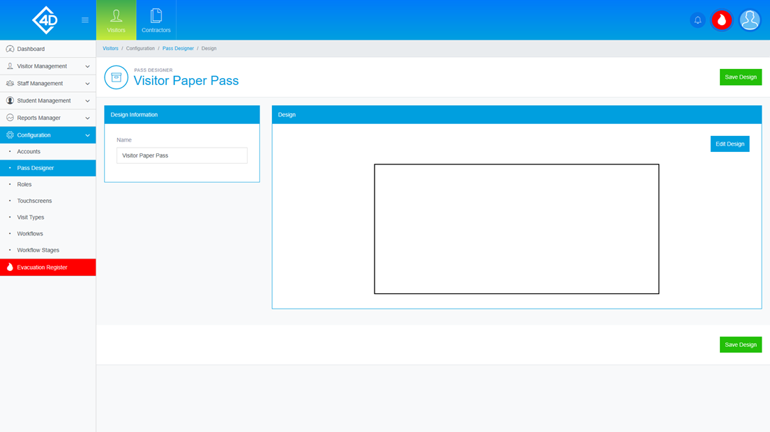
You can name your pass design by filling in the “Name” box in the “Design Information” section on the left side of the screen.
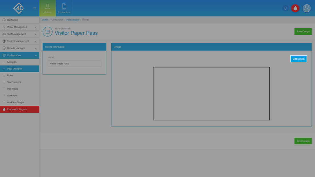
To begin creating your design, click on the “Edit Design” button.
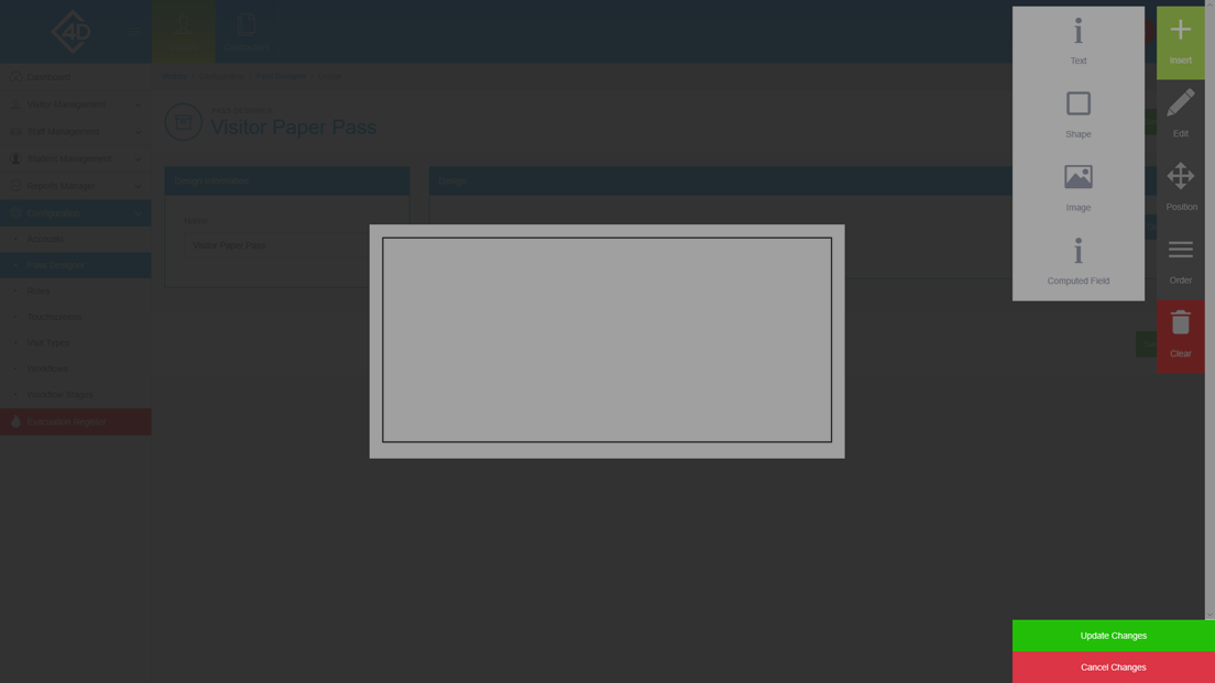
You will then be taken to the following screen.
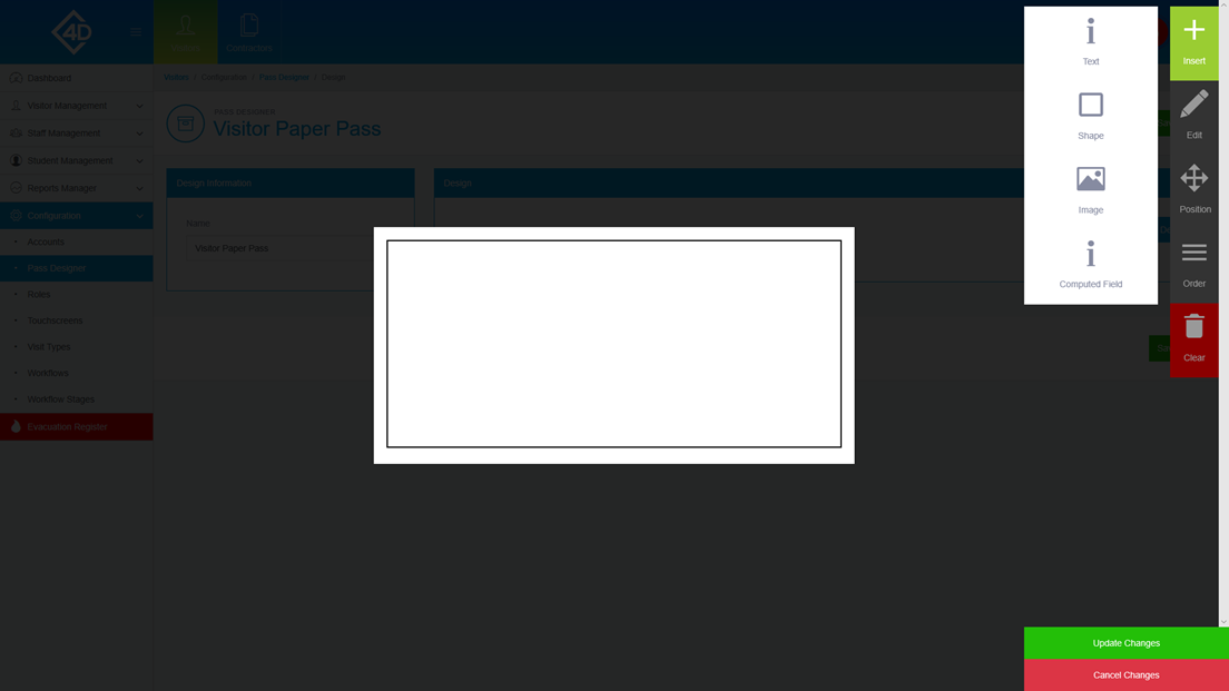
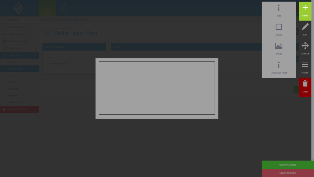
On the right of the screen you have 4 categories of elements, they are as follows.
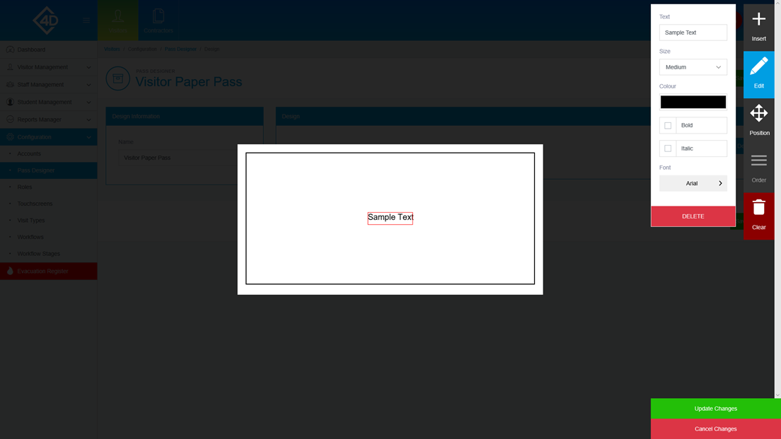
The “Text” category will allow you to input any text that is not linked to a database field, this is useful if you want to add a title.
You can choose the size of the text by clicking on the drop down below the “Size” section.
You can change the colour by clicking on the box below the “Colour” section, you can then choose from an RGB colour circle.
You can choose to make the font “Bold” and “Italic”.
You can finally choose your required font.
To delete the text field just click the red “Delete” button.
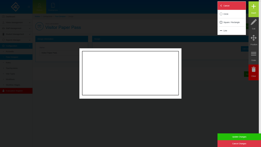
The “Shape” category will allow you to choose from a selection of 3 shapes.
To add a shape drag your selection from the right of the screen.
Once you have added a shape you can edit it to suit your branding, you can change the proportions of the shape along with the colour.
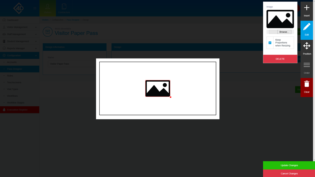
The “Image” category will allow you to upload an image of your choosing to the pass design.
When you have clicked on the “Image” button you will be prompted to browse for an image file, you can also do this by clicking the “Browse” button.
To change the size of the image, drag the red box at the bottom right of the image, if you need to change the proportions untick the “Keep Proportions when Resizing” box.
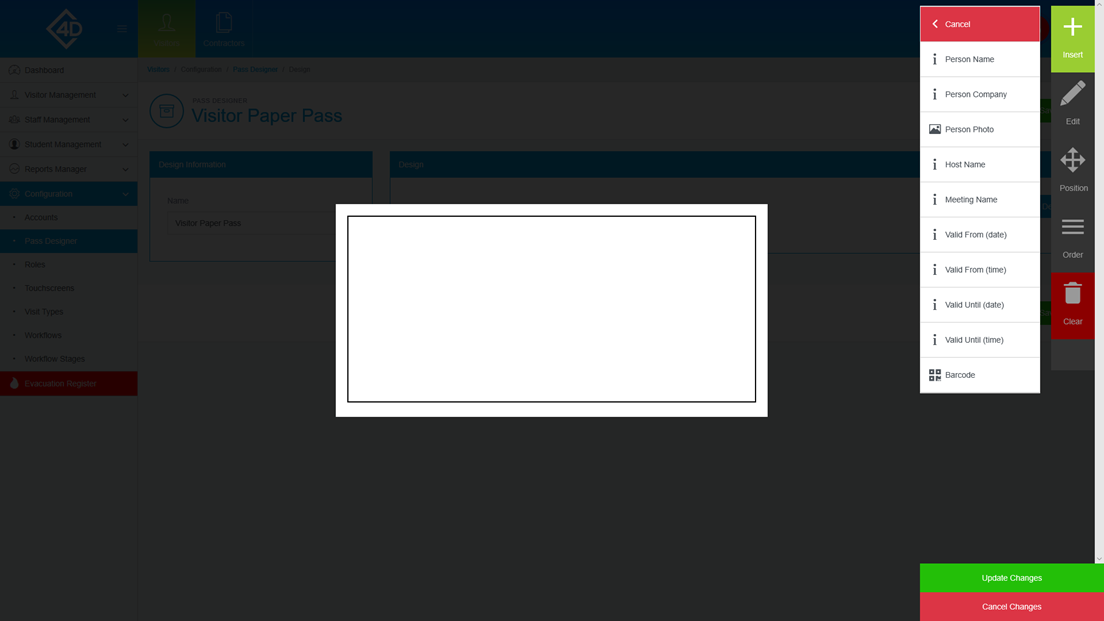
The “Computed Field” category will allow you to choose from a selection of database fields to add to your design.
The fields are as follows:
- Person Name – This field displays the first and last name of the visitor.
- Person Company – This field displays the visitor’s company.
- Person Photo – This field displays the visitor’s photo that has been taken by the system.
- Host Name – This fields displays the hostname of the meeting, this is usually a staff member.
- Meeting Name – This field displays the name of the meeting.
- Valid From (date) – This field displays the date that the pass is valid from.
- Valid From (time) – This field displays the time that the pass is valid from.
- Valid Until (date) – This field displays the date that the pass is valid until.
- Valid Until (time) – This field displays the time that the pass is valid until.
- Barcode – This field displays the QR code that is assigned to the visitor.
Each field can be resized as needed, any text field can also have the colour, font, size and effects changed.
The tools bar is used to alter the pass design as you wish, the features are as follows;
- Insert – This allows you to add Text, Shapes, Images and Computed Fields.
- Edit – This allows you to alter any existing elements within the pass design.
- Positions – This allows you to fine tweak the position of any elements.
- Order – This allows you the re-order any existing elements, this is mostly used to place elements in front of other elements.
- Clear – This button completely clears the design, do not use this if you wish to only delete a single element.
To submit your changes click the “Update Changes” button.
To cancel your changes click the “Cancel Changes” button.
Once you have clicked the “Update Changes” button you will be taken back to the preview page.
If you are happy with your design, click the “Save Design” button on the right side of the screen.